.png)
Mobile-first indexing explained: boost your e-commerce visibility
- Darren Burns
- Apr 22
- 8 min read


TL;DR:
Google now ranks based on your mobile site, not desktop, affecting search visibility.
Poor mobile optimization can lead to up to 43% organic traffic loss and lower rankings.
Ongoing regular audits and optimized mobile design are essential for sustained mobile-first success.
Most UK and Irish e-commerce owners still think of their desktop site as the “real” one. Google disagrees. Since completing its rollout of mobile-first indexing, Google uses your mobile site to determine where you rank in search, not your desktop version. For retailers where over 60% of traffic is mobile, this shift is not a technical footnote. It is the difference between appearing on page one and disappearing entirely. This article walks you through exactly what mobile-first indexing means, the practical impact on your store, the technical steps to get it right, and the mistakes that quietly kill rankings.
Table of Contents
Key Takeaways
Point | Details |
Google indexes mobile first | Google uses the mobile version of your site for ranking, so mobile optimisation matters more than ever. |
Poor mobile usability costs sales | Missing or broken mobile features can result in up to 43% less organic traffic and lost customers. |
Regular audits boost results | Review your site monthly to catch and fix issues ensuring higher visibility and conversions. |
Responsive design is essential | A single, mobile-friendly website for all devices prevents content mismatches and boosts SEO. |
What is mobile-first indexing and why it matters
Mobile-first indexing is straightforward in principle. Google uses the mobile version of your content, not the desktop version, to crawl, index, and rank your pages. If your mobile site is missing product descriptions, has broken images, or loads slowly, Google treats that stripped-down experience as your actual site. The desktop version becomes largely irrelevant for ranking purposes.
This shift happened because the way people shop changed faster than most businesses adapted. In the UK and Ireland, mobile now accounts for well over 60% of retail browsing traffic, and in some product categories that figure climbs even higher. The gap between how a site performs on desktop and how it performs on mobile directly affects how visible it is to shoppers who are ready to buy.
Metric | Desktop | Mobile |
Share of retail traffic | ~35% | ~65% |
Average conversion rate | 3.9% | 2.2% |
Bounce rate | ~40% | ~52% |
Google indexing priority | Secondary | Primary |
The table above tells a story that matters for your bottom line. Mobile drives the majority of traffic but converts at a lower rate, partly because many sites still deliver a frustrating mobile experience. Close that gap and you capture both the rankings and the revenue.
“Your mobile site is your site, as far as Google is concerned. If it is incomplete, slow, or broken, your rankings will reflect that reality.”
For e-commerce brands on platforms like Shopify, WooCommerce, or Magento, the practical implication is clear. Every decision about content, structure, and performance needs to start with mobile, not end with it. Our mobile SEO guide goes deeper into platform-specific considerations if you want to explore further.
How mobile-first indexing impacts your e-commerce website
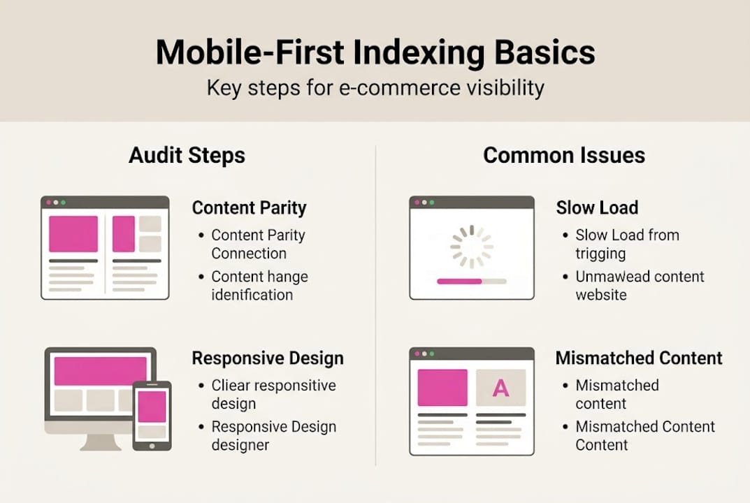
The impact is not just theoretical. Poor mobile optimisation can cause up to a 43% drop in organic traffic when there is a mismatch between your desktop and mobile content. That is nearly half your search visibility gone, not from a Google penalty, but simply from neglect.
Several common pitfalls show up repeatedly across UK and Irish e-commerce sites. Content mismatches are the most damaging. If your desktop product pages include full specifications, reviews, and structured descriptions but your mobile version hides or truncates that content to save space, Google indexes the shorter version. You lose ranking signals that took months to build.
Load speed is the second major issue. Google’s Core Web Vitals are built around mobile performance. A desktop site that loads in 1.8 seconds might crawl to 5 or 6 seconds on mobile over a 4G connection, which pushes you below the threshold Google considers acceptable.

Intrusive popups and interstitials are a third trap. Aggressive newsletter popups or cookie consent banners that cover the full screen on mobile are a direct ranking signal against you. Google has explicitly penalised this pattern since 2017 and continues to do so.
Here is what to check immediately:
Tap targets: Buttons and links must be at least 48px tall. Too small and Google flags them as a usability failure.
Font size: Body text should be at least 16px on mobile. Smaller text forces users to zoom, which signals a poor experience.
Content parity: Every product description, image, and review visible on desktop must also be present and accessible on mobile.
Viewport configuration: Your site must include a proper viewport meta tag so mobile browsers render it correctly.
Pro Tip: Always test your site on actual physical devices, not just browser dev tools. Chrome’s mobile emulator does not replicate real network conditions or touch behaviour accurately. Use a mix of Android and iOS devices at different screen sizes.
If you want a structured approach, our guide to optimise for mobile conversions and our website optimisation checklist are good starting points.
Technical essentials: getting mobile-first indexing right
Once you understand the stakes, the next step is a structured technical audit. Most e-commerce owners are surprised by how many small misconfigurations compound into significant ranking losses.
If you run a single responsive site (which Google recommends), the main task is ensuring parity: that everything present and crawlable on desktop is equally present and crawlable on mobile. Where sites use a separate mobile subdomain (typically m.yourdomain.com), you must use "rel=canonicalon the mobile page pointing to the desktop URL, andrel=alternate` on the desktop pointing to the mobile URL. Get these reversed and Google may index the wrong version or ignore one entirely.
For JavaScript-heavy stores, render budget is a critical constraint. Googlebot has limits on how much JavaScript it will process before moving on. If your product pages rely heavily on client-side rendering to load key content, there is a real risk that Google indexes a near-empty page. Server-side rendering for product and category pages is strongly advisable.
Here is a practical technical health check for your store:
Open Google Search Console and navigate to the Mobile Usability report. Fix every flagged issue before moving on.
Use the URL Inspection tool on your most important product pages. Compare the rendered mobile and desktop versions side by side.
Audit your product schema markup. Confirm that structured data (price, availability, reviews) is present in your mobile HTML, not injected after page load.
Check that all images on product pages include descriptive alt text. Mobile Googlebot treats missing alt text as a content gap.
Run a Core Web Vitals report for mobile specifically. Largest Contentful Paint (LCP) should be under 2.5 seconds, Cumulative Layout Shift (CLS) under 0.1.
Verify your robots.txt file does not block Googlebot from crawling CSS or JavaScript files your mobile site depends on.
Pro Tip: Use Google Search Console’s URL Inspection tool, not just a third-party crawler, to confirm what Google actually sees when it renders your mobile pages. Third-party tools often miss JavaScript rendering issues entirely.
For a full step-by-step process, our mobile SEO checklist covers each of these points in detail, and our web accessibility guide addresses overlapping requirements that affect both rankings and legal compliance.
Common mobile-first indexing mistakes to avoid
Even technically capable teams make consistent errors when it comes to mobile-first readiness. Knowing what to look for saves you from discovering these issues through a traffic drop.
The most common mistakes we see across UK and Irish e-commerce sites include:
Inconsistent metadata: Title tags and meta descriptions differ between desktop and mobile versions. Google indexes the mobile metadata, so if it is shorter or less descriptive, your click-through rates suffer.
Missing viewport meta tag: Without ``, mobile browsers cannot render your site correctly. Google flags this as a critical usability failure.
Tap targets under 48px: Small buttons and navigation links are one of the most frequently reported issues in GSC Mobile Usability reports.
Text too small to read: Body text below 12px is flagged automatically. Below 16px is practically unreadable for most users.
Popups that trigger immediately: Full-screen interstitials that appear before a user has engaged with any content are penalised directly.
Lazy-loaded content not rendering: If images or product details load only after user interaction, Googlebot may not see them at all.
“The mobile experience is not the stripped-down version of your site. It is the version. Build it that way from the start.”
The most important habit you can build is regular auditing. Check Google Search Console’s Mobile Usability report monthly. Look for new flags after every site update, theme change, or plugin addition. Many issues appear not from a redesign but from a small code change that breaks viewport settings or injects an intrusive element.
Our guide on SEO mistakes to avoid covers a wider range of ranking errors specific to the UK e-commerce context.
Our perspective: why mobile-first success is a continuous process
Most guides on mobile-first indexing treat it as a checklist. Fix the viewport, check the schema, close the ticket. We have seen that approach fail, repeatedly, with clients who had technically sound sites that still bled traffic over six to twelve months.
The reality is that mobile is not static. Device screen sizes keep changing. User behaviour evolves. New Shopify themes introduce layout changes. A plugin update shifts a button a few pixels. Suddenly a tap target is too small and you have no idea why your bounce rate climbed.
The brands that maintain strong mobile search visibility are not the ones who got it right once. They are the ones who treat mobile optimisation as a regular business operation, not a one-off project. Monthly audits, quarterly device testing, and consistent reviews of Core Web Vitals data are what separate the stores that grow from the ones that plateau.
Our digital marketing advice consistently points to the same lesson: algorithms reward sustained effort, not single fixes. Build the process, not just the solution.
Ready to optimise your shop for mobile-first indexing?
If this article has surfaced gaps in your current mobile setup, you are already ahead of most competitors who still treat mobile as an afterthought. The next step is getting expert eyes on your specific site.

As e-commerce visibility experts with over 25 years of experience scaling our own and our clients’ stores, we know exactly where mobile-first issues hide and how to fix them without disrupting your trading. Whether you need a full technical audit, ongoing SEO support, or want to start with our in-depth mobile SEO guide, we can help you build a mobile presence that ranks, converts, and keeps pace with how your customers actually shop.
Frequently asked questions
How do I check if my site is ready for mobile-first indexing?
Use Google Search Console’s Mobile Usability and URL Inspection tools to confirm your mobile version is being indexed correctly. GSC parity audits are the most reliable starting point for identifying gaps between your mobile and desktop versions.
What’s the risk if I haven’t updated my mobile site?
You could see significant drops in search rankings and up to a 43% decline in organic traffic if your mobile site content does not match your desktop version or fails core usability standards.
Do I need a completely separate mobile and desktop site?
No. Google strongly prefers a single responsive design that serves all devices, with identical content, metadata, and structured data across every screen size.
How often should I audit my e-commerce site for mobile readiness?
Monthly reviews are recommended. Regular audits ensure you catch issues introduced by theme updates, new plugins, or algorithm changes before they impact your rankings and revenue.
Recommended
Comments