.png)
How to Optimise for Mobile and Boost Ecommerce Conversions
- Darren Burns
- 3 days ago
- 7 min read


Frustration mounts each time a customer abandons their basket on a slow or clunky mobile site. As online shopping habits in the United Kingdom and Ireland shift rapidly towards mobile, a seamless experience is now a necessity. Backed by comprehensive Baymard Institute research, addressing specific mobile usability pitfalls is proven to unlock higher conversions and customer satisfaction. This guide reveals targeted actions any ecommerce owner can take to transform their mobile performance and delight shoppers using smartphones.
Table of Contents
Quick Summary
Key Insight | Explanation |
1. Evaluate mobile experience | Assess your current mobile usability to identify gaps affecting conversions. |
2. Focus on responsive design | Implement adaptable layouts for seamless user experiences across devices. |
3. Simplify navigation & checkout | Streamline processes to reduce friction and enhance user purchase completion. |
4. Improve site performance | Optimise loading speeds to boost engagement and satisfaction for mobile users. |
5. Test on real devices | Conduct thorough testing on actual devices to uncover issues not visible in simulators. |
Step 1: Assess your current mobile experience
Analysing your existing mobile e-commerce performance is fundamental to driving higher conversions. Comprehensive mobile usability research reveals that most online stores have significant user experience gaps preventing optimal mobile engagement.
To thoroughly evaluate your current mobile experience, focus on these critical assessment areas:
Screen responsiveness across different device sizes
Touch interface navigation and interaction smoothness
Page load speed on mobile networks
Checkout process complexity
Visual clarity and readability
Start by conducting a detailed mobile audit using actual devices and analytics tools. Google Chrome’s mobile developer tools can simulate various screen sizes, helping you identify potential design and functionality issues.
Mobile users are 5x more likely to abandon a purchase if the experience feels clunky or unintuitive.
Pay special attention to critical conversion touchpoints like product pages, shopping cart, and payment screens. Mobile user behaviour studies consistently demonstrate that small friction points can dramatically reduce purchase completion rates.
Professional recommendation: Conduct user testing with real customers to gain unfiltered insights into your mobile experience’s strengths and weaknesses.
Step 2: Prioritise responsive site design
Responsive site design is the cornerstone of modern mobile e-commerce success. Responsive web design trends demonstrate how critical adaptable layouts are for delivering seamless user experiences across diverse devices.
To create an effective responsive design, focus on these key implementation strategies:
Use flexible grid systems that automatically adjust to screen sizes
Implement CSS media queries for precise layout control
Optimise image scaling to maintain visual quality
Design with a mobile-first approach
Ensure touch-friendly navigation elements
Technical implementation research emphasises the importance of considering bandwidth limitations and diverse device capabilities during design. Modern responsive design goes beyond simple resizing - it requires intelligent content adaptation.
Responsive design is not just about looking good, it’s about creating an optimal user experience across all devices.
Prioritise performance by using lightweight design techniques, minimising HTTP requests, and implementing efficient loading strategies for mobile users. Test your design thoroughly on multiple devices to ensure consistent functionality and visual appeal.

Professional recommendation: Regularly audit your responsive design using real device testing and comprehensive performance measurement tools to stay ahead of evolving mobile user expectations.
Step 3: Streamline navigation and checkout
Creating a frictionless mobile shopping experience requires strategic simplification of your navigation and checkout processes. One-click checkout research demonstrates how reducing transaction complexity directly impacts customer spending and engagement.
Implement these critical navigation and checkout optimisation strategies:
Reduce menu complexity with clear, concise categories
Implement progressive disclosure for navigation menus
Create thumb-friendly touch targets
Minimise form field requirements
Offer guest checkout options
Digital consumer behaviour studies reveal that simplified navigation directly correlates with higher conversion rates. Mobile users demand speed and intuitive interfaces that anticipate their needs.
Simplicity in navigation isn’t just a design preference - it’s a core requirement for mobile e-commerce success.
Prioritise a clean, minimalist approach that guides users seamlessly from product discovery to purchase. Eliminate unnecessary steps, provide clear progression indicators, and ensure that each interaction feels purposeful and efficient.
Professional recommendation: Conduct regular user testing to identify and remove any navigation or checkout friction points that might discourage mobile purchases.
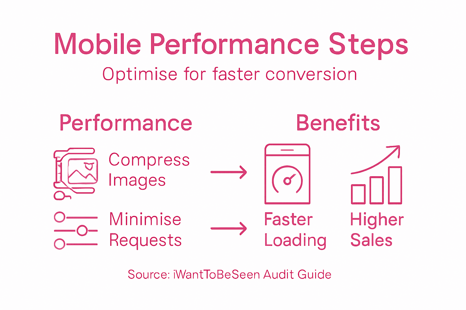
Step 4: Enhance performance and loading speed
Mobile users demand lightning-fast experiences, and your e-commerce site’s performance can make or break conversion rates. Performance optimization strategies reveal critical techniques for reducing loading times and improving mobile responsiveness.
Implement these key performance enhancement strategies:
Compress and optimise images for mobile display
Minimise HTTP requests by consolidating files
Use browser caching effectively
Enable content delivery networks (CDNs)
Reduce server response times
Implement lazy loading for images and content
Mobile app performance research demonstrates that even small improvements in loading speed can significantly boost user engagement and sales potential.
Every millisecond counts: Faster loading times directly translate to higher conversion rates and improved user satisfaction.
Prioritise a mobile-first approach to performance, focusing on lightweight design and efficient resource management. Regularly audit your site’s speed using tools like Google PageSpeed Insights, identifying and eliminating potential bottlenecks that could frustrate mobile users.
Professional recommendation: Conduct monthly performance audits and continuously test your mobile site’s loading speed across different devices and network conditions to maintain optimal user experience.
Step 5: Test and validate on real devices
Device testing is the critical final step in ensuring a seamless mobile e-commerce experience. Mobile usability testing methodology reveals that real-world device testing uncovers nuanced performance issues that simulators cannot detect.
Develop a comprehensive testing strategy with these essential approaches:
Acquire diverse device range covering different:
Screen sizes
Operating systems
Hardware capabilities
Test across network conditions
Verify touch interactions and responsive design
Check performance on cellular and wifi networks
Simulate real-world usage scenarios
Global mobile commerce research demonstrates significant variations in user experience across different devices, emphasising the importance of thorough testing.
Emulators can simulate, but only real devices reveal true user experience challenges.
Establish a systematic testing protocol that includes both automated and manual testing methods. Prioritise identifying and resolving device-specific performance bottlenecks that could compromise user satisfaction.
Professional recommendation: Create a dedicated testing device library representing your target market’s most common smartphones and systematically rotate testing across these devices every product update.
Below is a comparison of mobile device simulators versus real device testing in e-commerce optimisation:
Testing Method | Strengths | Limitations |
Simulator Testing | Quick and cost-effective | Misses real-world nuances |
Real Device Testing | Uncovers device-specific issues | Takes more resources and logistics |
Here is a summary of how each optimisation step in mobile e-commerce contributes to increased conversions:
Optimisation Step | Primary Benefit | Major Business Impact |
Mobile Experience Assessment | Identifies usability issues | Reduces abandonment and drop-offs |
Responsive Site Design | Ensures universal accessibility | Expands audience reach |
Streamlined Navigation & Checkout | Reduces purchase friction | Increases completed conversions |
Performance Enhancement | Decreases load times | Boosts engagement and satisfaction |
Real Device Testing | Finds hidden issues | Maintains consistent experience |
Transform Your Mobile E-Commerce Experience and Boost Conversions Today
Struggling with mobile usability issues like slow loading times or complicated checkout processes can cost you valuable customers every day. This article highlights the urgent need to prioritise responsive site design, streamlined navigation, and real device testing to eliminate friction and create smooth, high-converting mobile journeys.
Our digital marketing services at iWantToBeSeen specialise in SEO, AI, Social Media and PPC solutions tailored for eCommerce brands. With over 25 years of proven experience scaling successful online stores, we understand how to address the mobile optimisation challenges outlined in the guide. From enhancing your site’s responsiveness to accelerating loading speed and simplifying checkout, we help you implement strategies that lead to measurable growth.

Ready to stop losing mobile shoppers to frustration and delays? Partner with us at iWantToBeSeen for a comprehensive mobile optimisation and digital marketing strategy built to increase your conversions swiftly and sustainably. Explore how our expertise aligns with the strategies discussed and take the first step towards a seamless mobile shopping experience today.
Frequently Asked Questions
How can I assess my current mobile experience for e-commerce?
You can assess your current mobile experience by analysing screen responsiveness, touch interface navigation, and page load speed. Conduct a mobile audit using actual devices and analytics tools to identify usability gaps within 30 days.
What are key strategies for prioritising responsive site design?
To prioritise responsive site design, use flexible grid systems, implement CSS media queries, and optimise images for various devices. Aim to create a mobile-first design that adapts seamlessly across different screen sizes within your next design update.
How can I streamline navigation and checkout for mobile users?
Streamlining navigation involves reducing menu complexity and designing thumb-friendly touch targets. Implement guest checkout options and minimise form field requirements, aiming to simplify the process to boost conversions by at least 15%.
What performance enhancements can improve mobile loading speed?
To improve mobile loading speed, compress images, minimise HTTP requests, and enable content delivery networks (CDNs). Focus on reducing server response times to achieve faster load times within 1–2 seconds for a better user experience.
How important is it to test my mobile site on real devices?
Testing your mobile site on real devices is crucial as it uncovers device-specific performance issues that simulators may miss. Establish a testing protocol to ensure a consistent user experience and address any identified issues with each product update.
How often should I conduct performance audits for my mobile e-commerce site?
Conduct performance audits for your mobile e-commerce site monthly to identify and eliminate potential speed bottlenecks. Regular audits help maintain optimal user experiences and can improve conversion rates over time.
Recommended
Comments